My Sketchbook - First Critique
PAGE 1
|

PAGE 2
|
PAGE 3
|
PAGE 4
|
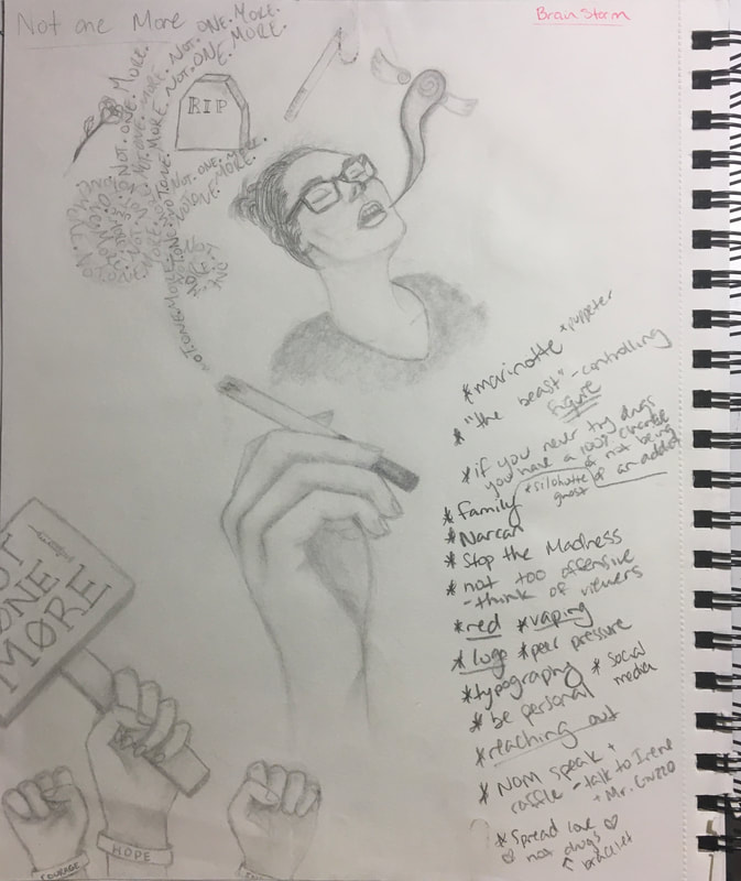
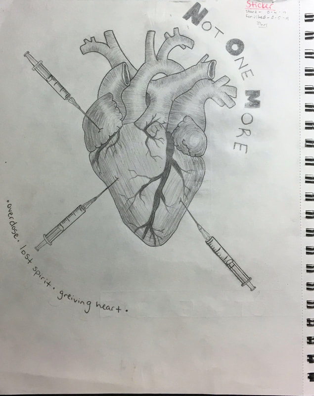
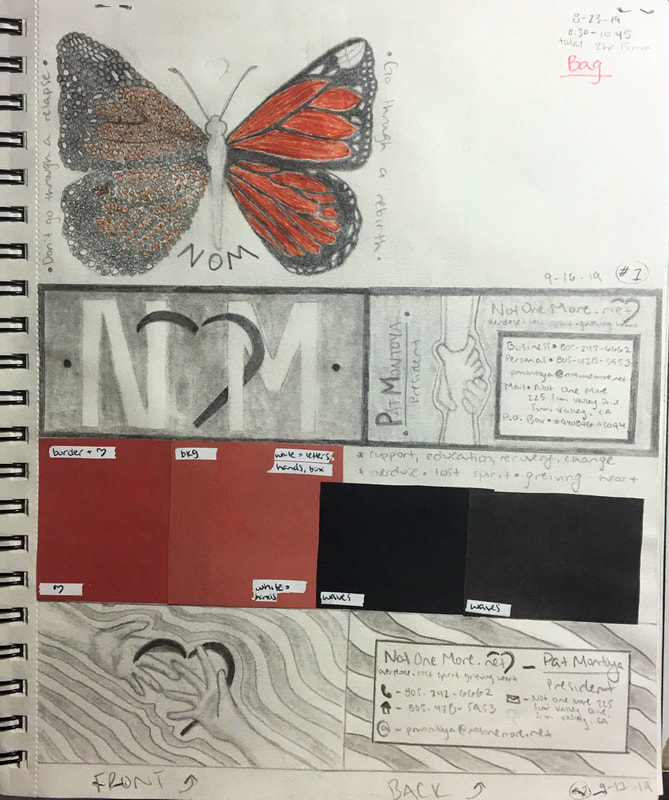
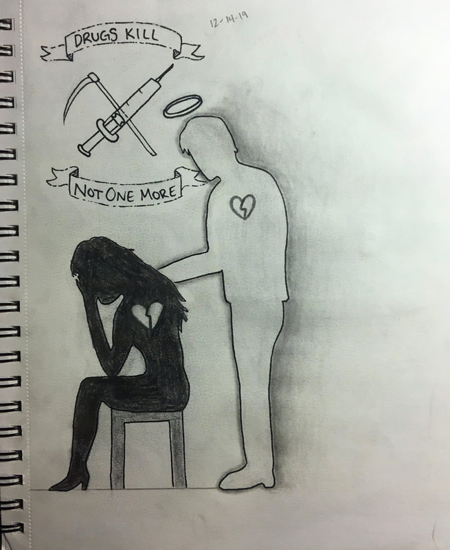
The first time I met with my client he said he was impressed with what he was seeing but was worried that my art would be too graphic for it's viewers. I told him that I planned on making some into shirts or stickers or bags but he wasn't very responsive during the first meeting. He wasn't into the idea of creating more products that people would buy. I left this meeting feeling let down, disappointed, and like my art wasn't good enough. He did give me a list of topics he'd like to see in a design which was very helpful. I referenced this list that I wrote on PAGE 1 throughout the rest of my senior project. I ended up resenting these pages in my sketchbook because I saw them as a failure but I was actually fond of the bottom design, which was for a business card, on PAGE 4. I took the part of my sketch that was meant for the front of the card, I put it into Illustrator, and I recreated my design digitally.
My Sketchbook - Second Critique
PAGE 5
|
PAGE 6
|

|
|
|
PAGE 7
|
PAGE 8
|
The second meeting went a lot better. We were still not on the same page about what I wanted to put me designs on but we were working on it. My client liked PAGES 5 and 8 but he really disliked PAGE 7. He thought is looked like the boogeyman and didn't even want to look at the picture anymore. It was an understandable opinion, I wasn't fond of the picture either but it was an idea I had and I couldn't move on without putting in on paper. At the end of the meeting he told me that he wanted me to look at the list he gave me during our first meeting and try to draw more stuff like that. Before this meeting, when I was creating these sketches, I was feeling very discouraged. I had a lot of thoughts like "Maybe this project won't work out," "What if I am not cut out to be a graphic designer," "What if I am not as good of an artist that I thought I was," and "I don't know how to continue through this project." I texted my mentor and explained my situation, he told me to maybe consider making other material and to change what I wanted to put my designs on. He helped me get out of my art block and just keep drawing. My mother and boyfriend also helped me. They pushed me to try my best and to not give up. My boyfriend actually helped me and motivated me to draw the design on PAGE 5 which is a design that my client loved. I also showed him the digital version of the digital version of the front of the business card on PAGE 4. He absolutely loved this as well.
My Sketchbook - Third Critique
PAGE 9
|
PAGE 10
|
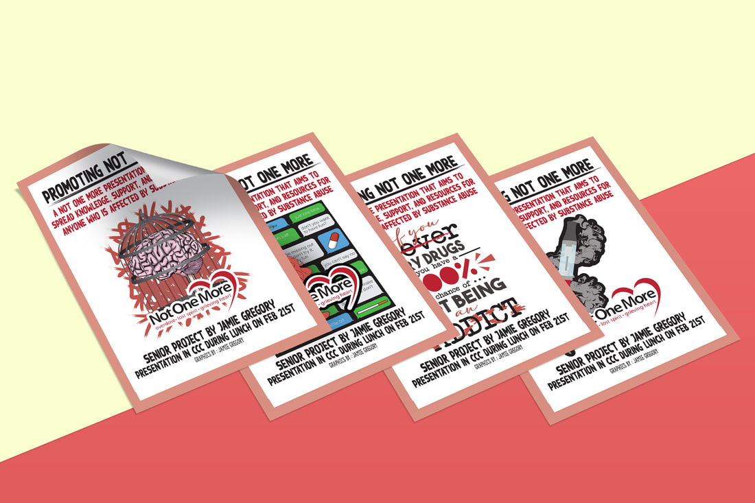
This was the best meeting I had out of the three. My client and I actually got on the same page. I changed my products that I previously wanted to design into creating a business card, an educational pamphlet, and four posters with flyers to put around my school to promote my senior project. I showed him my sketches and he loved every single one of them. He also brought up the sketch on PAGE 5 and said he wanted that on the pamphlet. He wanted me to finish the business card I had already started and to create the four posters. One poster was about peer pressure, another was about mental health, the other one was about vaping, and the last one was a typography poster with a quote the client uses frequently.
Making My Sketches Digital
|
|
|
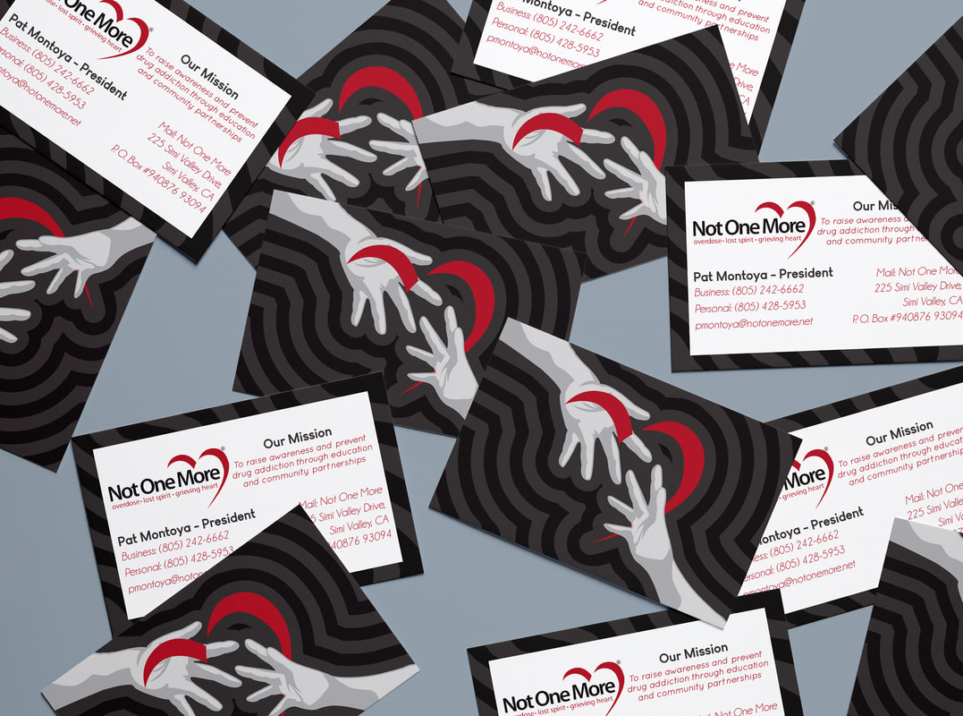
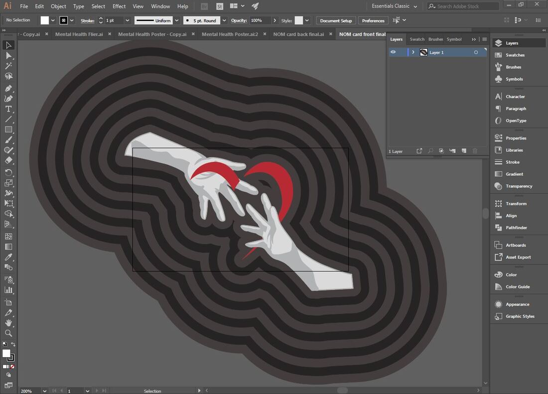
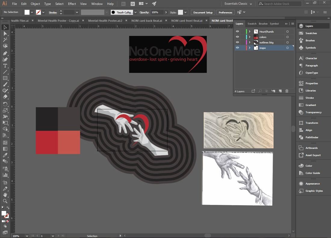
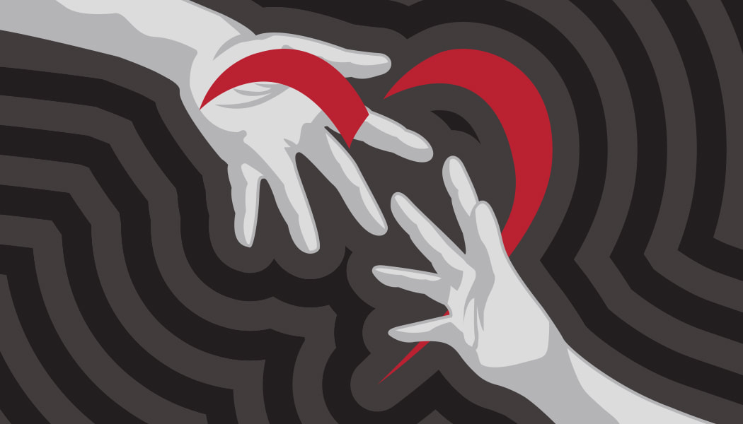
I started off by remaking the NOM logo by using the pen tool and tracing over the original logo. This allowed me to be able to resize the logo throughout my pieces in the best quality. Then I made the front cover of the business card that I showed my client during our second meeting. I reused the heart I recreated in the first Illustrator file then outlined two hands and outlined them by offsetting the path repeatedly.

|
|
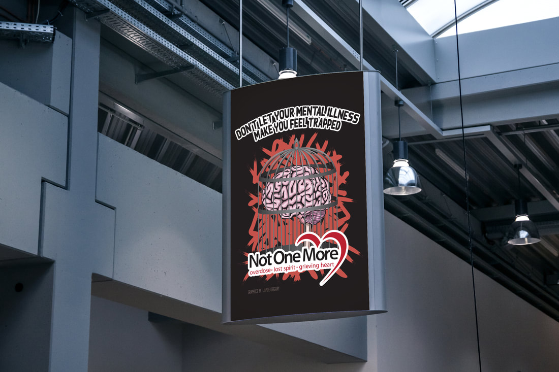
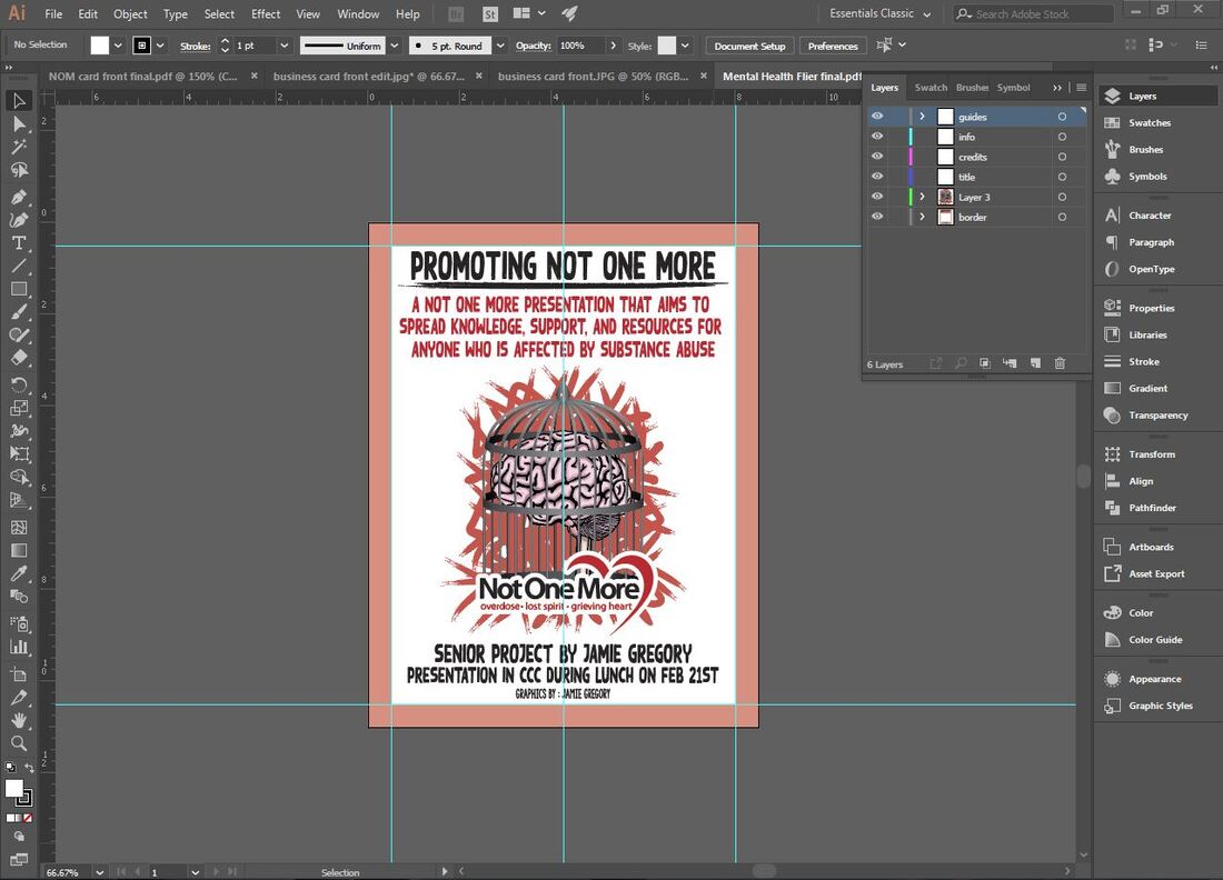
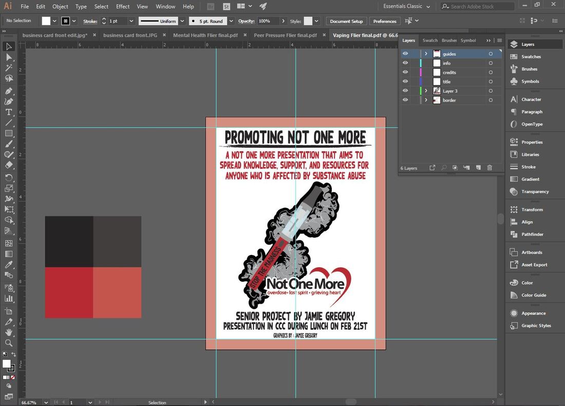
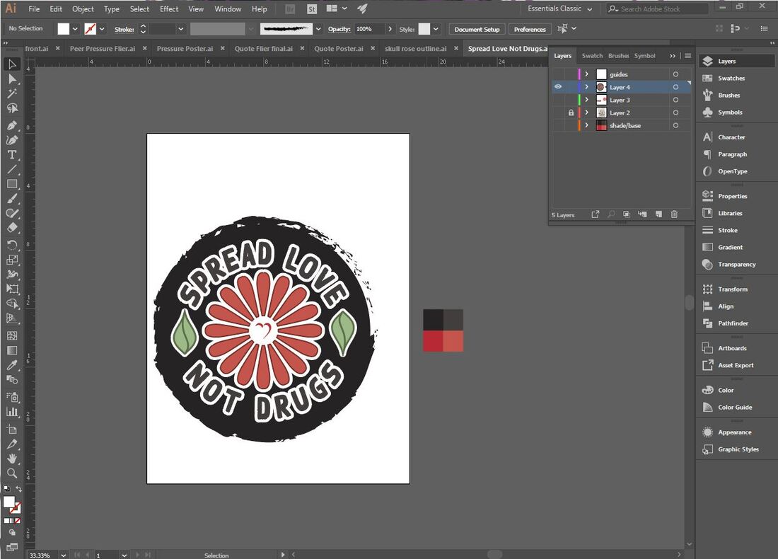
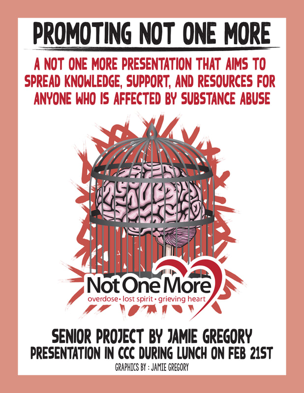
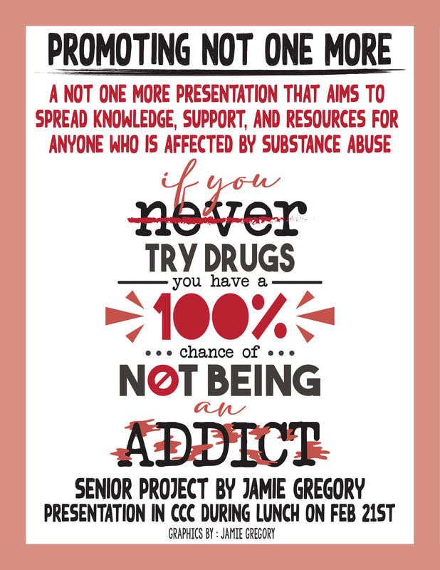
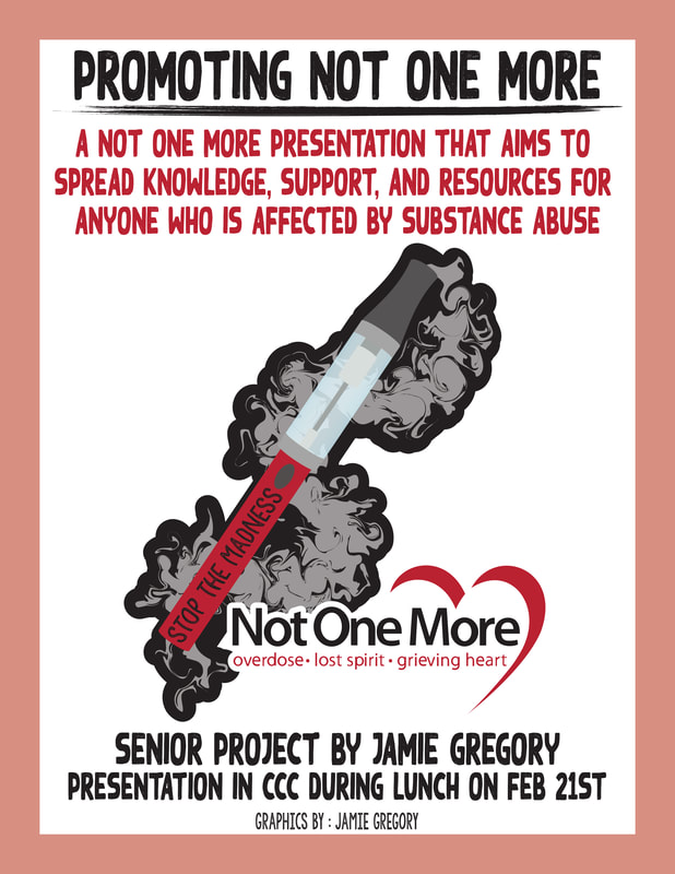
I took the NOM logo and used it for both the poster and flyer. I outlined a brain, recreated the cage from my sketch, and added color in both. The cage was colored in with gradients and the brain had shaped that acted as highlights and shadows. I took the brush tool, selected a "grunge" brush created by the program, and made angular lines behind the main focus of the poster. I typed out a slogan I came up with and gave it an arch for the poster with an offset path to make an outline. For the flyer I reused all the elements except fore the typography. At the top I put the name of my senior project at the top and then I described what the event was. At the bottom I put that the event was my senior project, where and when the presentation was being held, and then I said that the graphics were made by me.
|
|
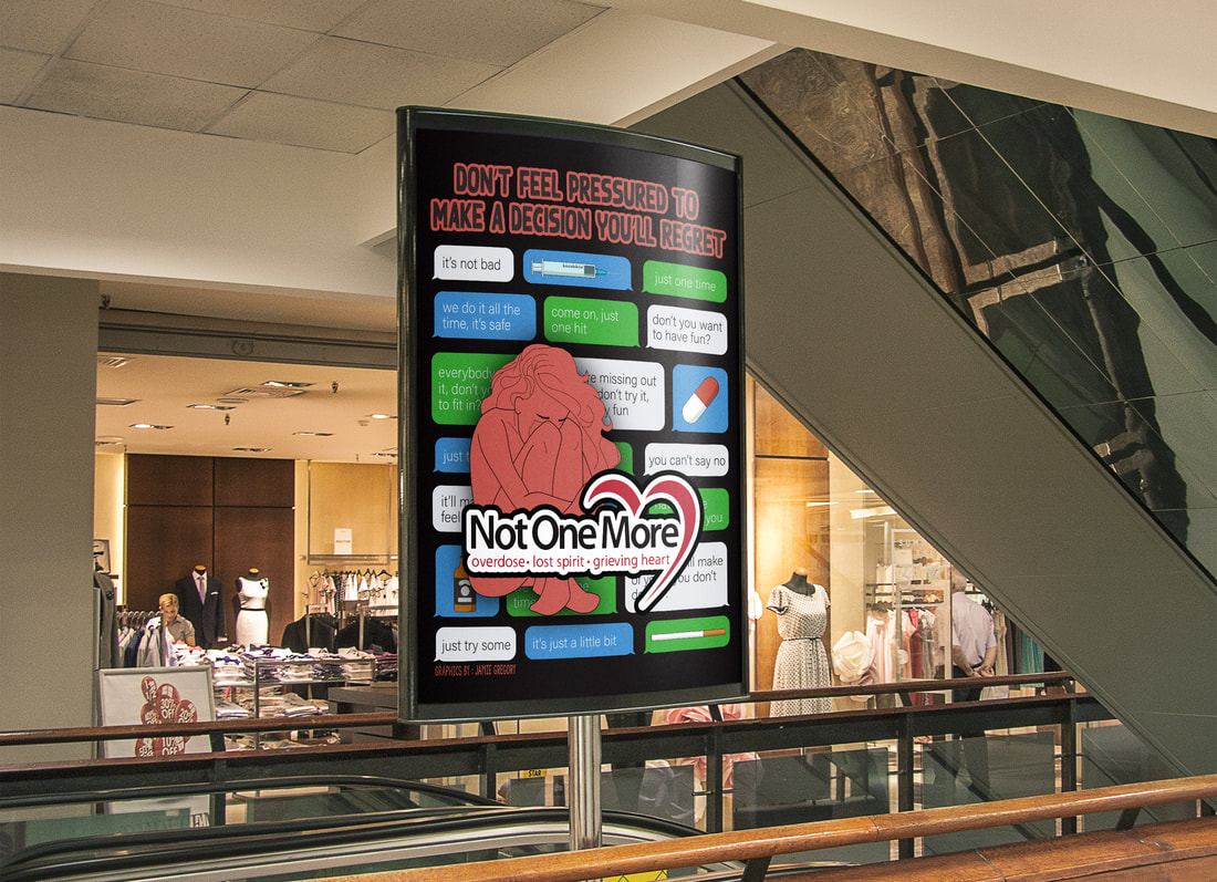
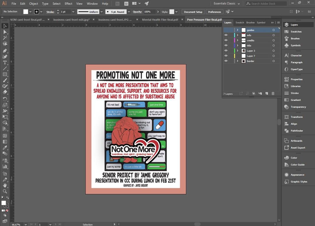
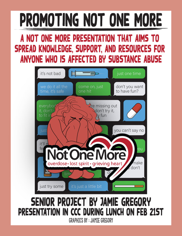
This design had the most elements involved. I had to outline iPhone text bubbles, find the correct font for the text messages, create outlines for different substances, outline the person in the front, and research common peer pressure quotes. I laid out all the text bubbles on the page, leaving room for the text, and then I filled in all the quotes and added the substances. I traced the person, added a fill, and reflected her so that she faced the left instead of the right. This allowed me to fit the NOM logo in front of her without cutting all of her off. I gave her a drop shadow to make her not blend into the busy background. I took my finished product and put it on my flyer template.
|
|
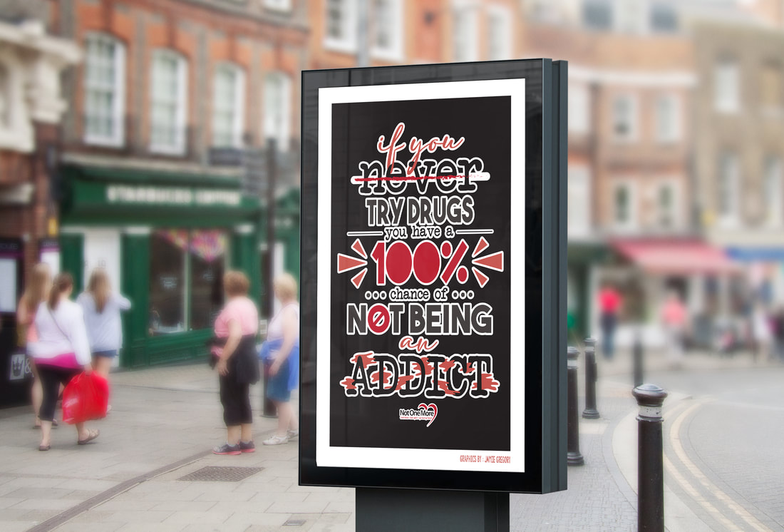
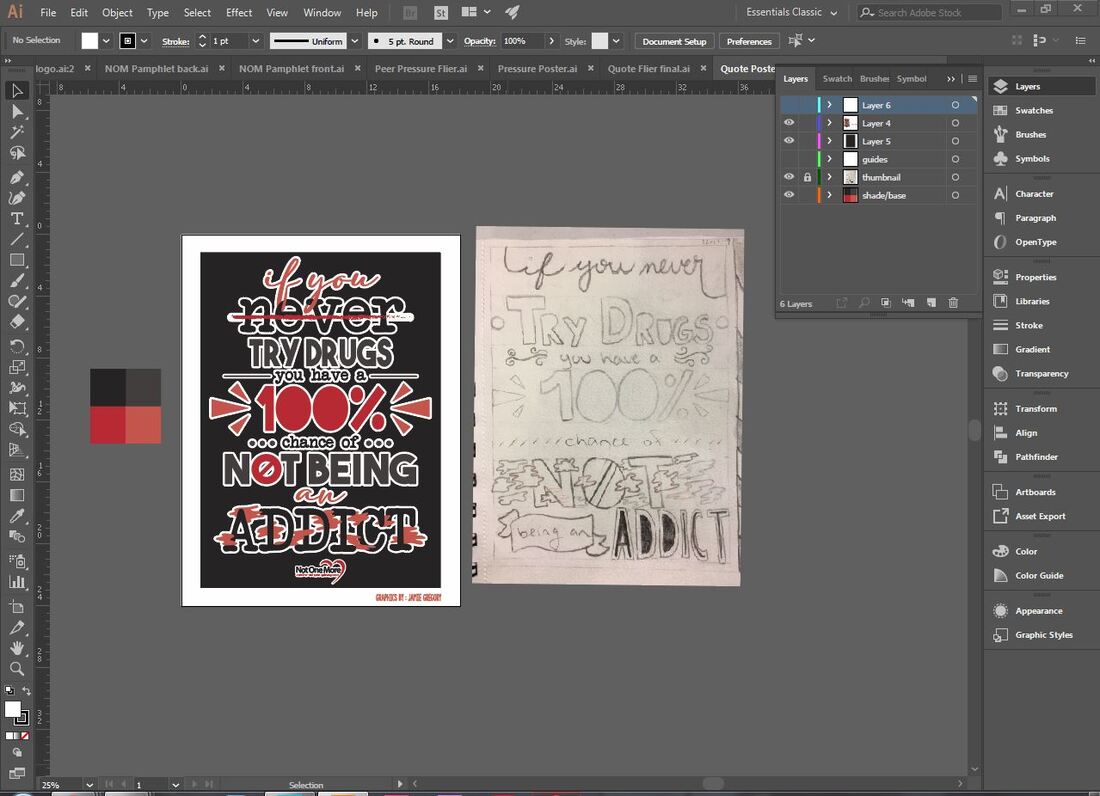
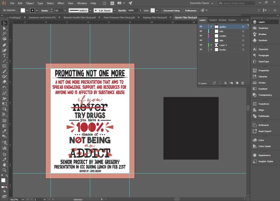
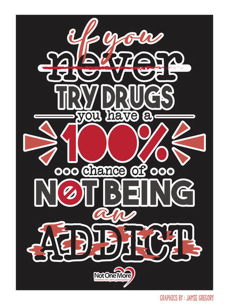
This design changed the most from my initial sketch. I used three different fonts and kept to the same color palette. I kept the cursive fonts, the triangles by the 100%, the crossed out "O" in not, and the cloud-like shapes. I did change the placements of the words and the layout slightly so it would have a better composition. I also added a few graphic elements and put the logo of NOM at the bottom of the typography. I took my design and made it into a flyer with the same layout.
|
|
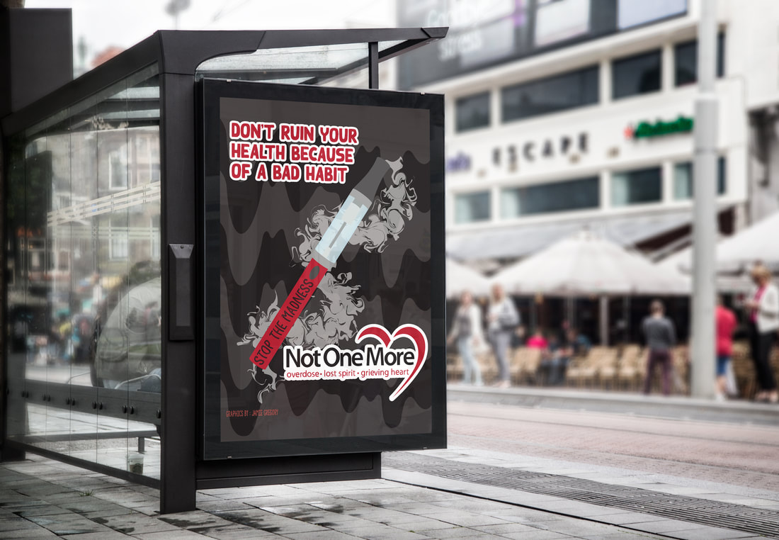
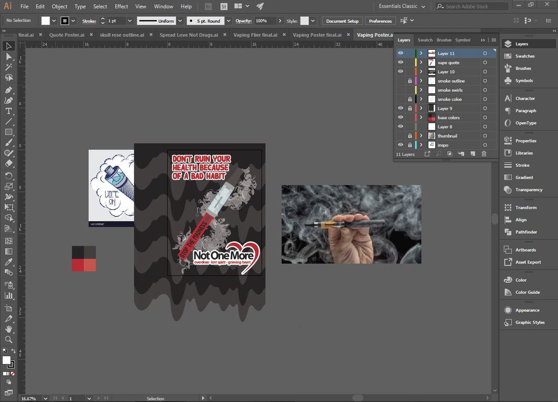
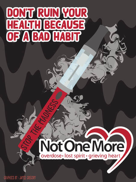
This was my most difficult design to create. I traced my entire sketch, including the vape pen and the drooping background, but I struggled to create the smoke element. I created this element by using the pen tool to make an action line for the smoke and then I used the twirl tool to create the smoke cloud effect. Once I finished the smoke cloud I made it a little bit transparent and put it under the layers that made up the vape pen. When I was finished I did the same thing that I did with all my other poster designs, I put it on my flyer template to hang around my school to promote the event.
|
|
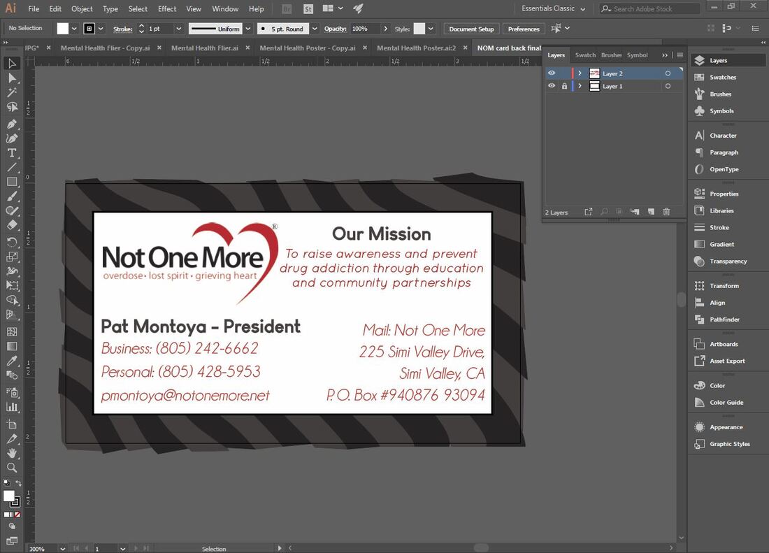
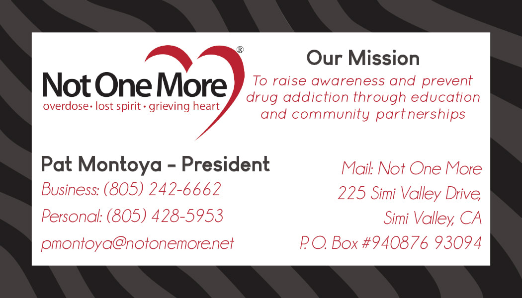
As I said earlier, I created the front of the card design after my first meeting with my client. I took the same element in the background and reused it for the back of the card as well. I put a white box over the design and used the same information from NOM's previous business card. All I did was change the layout, pick a different font, and add color.
|

|
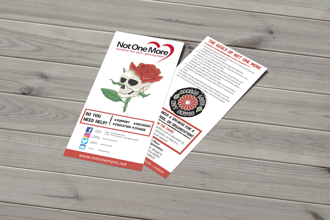
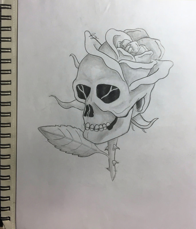
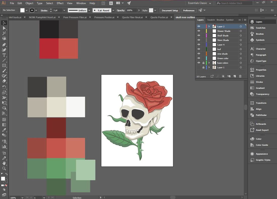
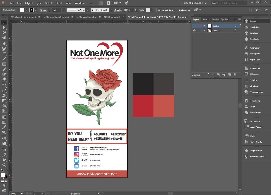
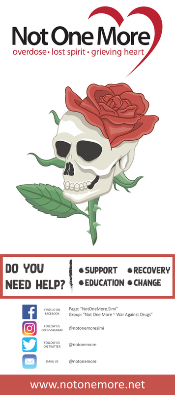
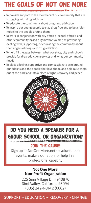
I took my sketch of the skull flower and I digitally traced over it exactly in Illustrator. After that I created a whole color palette and added color, highlights, and shadows to the image. I traced over my sketch for the flower design as well but I made the flower petals perfectly spaced by using the rotate tool. I reused the same fonts from my posters and curved the text to fit around the flower in a circle. I also added a circle around the flower to make the design look more solidified. I took inspiration from NOM's original pamphlet and redesigned it. I added my designs, red boxed, more fonts and colors, and I created a new layout. Every bit of information was kept the same, I just reorganized it.
Final Products
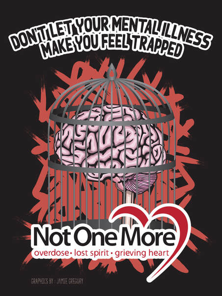
Mental Illness Poster
|
Mental Illness Flyer
|
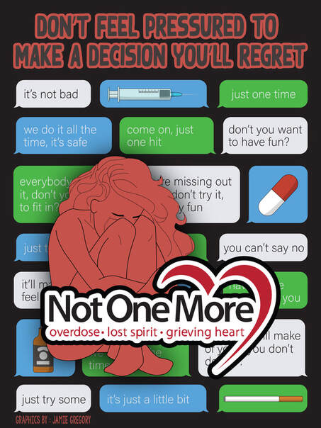
Peer Pressure Poster
|
Peer Pressure Flyer
|
Typography Poster
|
Typography Flyer
|
Vaping Poster
|
Vaping Flyer
|
Business Card - Front
|
Business Card - Back
|
Pamphlet - Front
|
Pamphlet - Back
|
Mock Ups